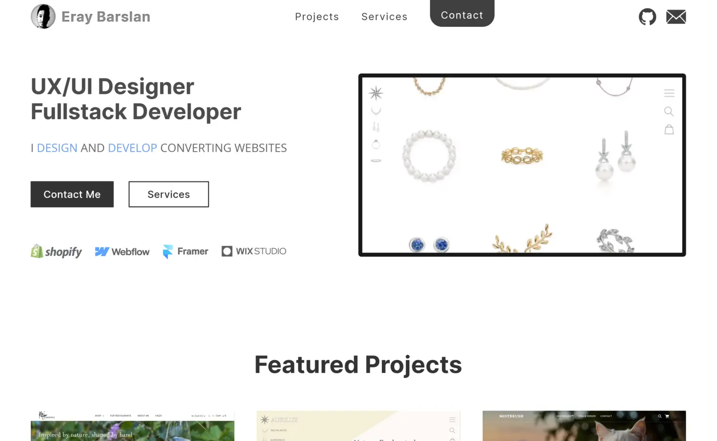
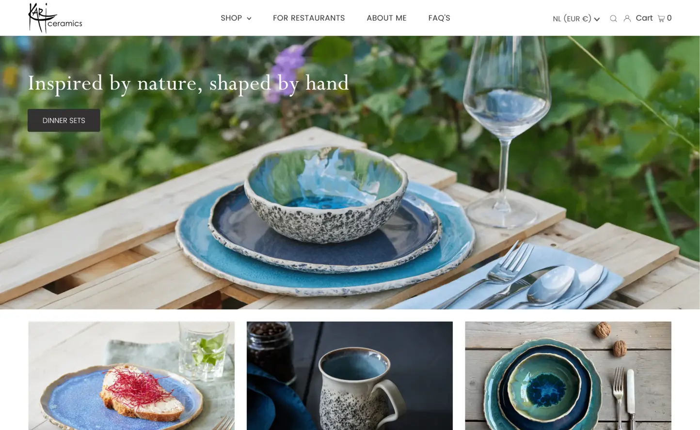
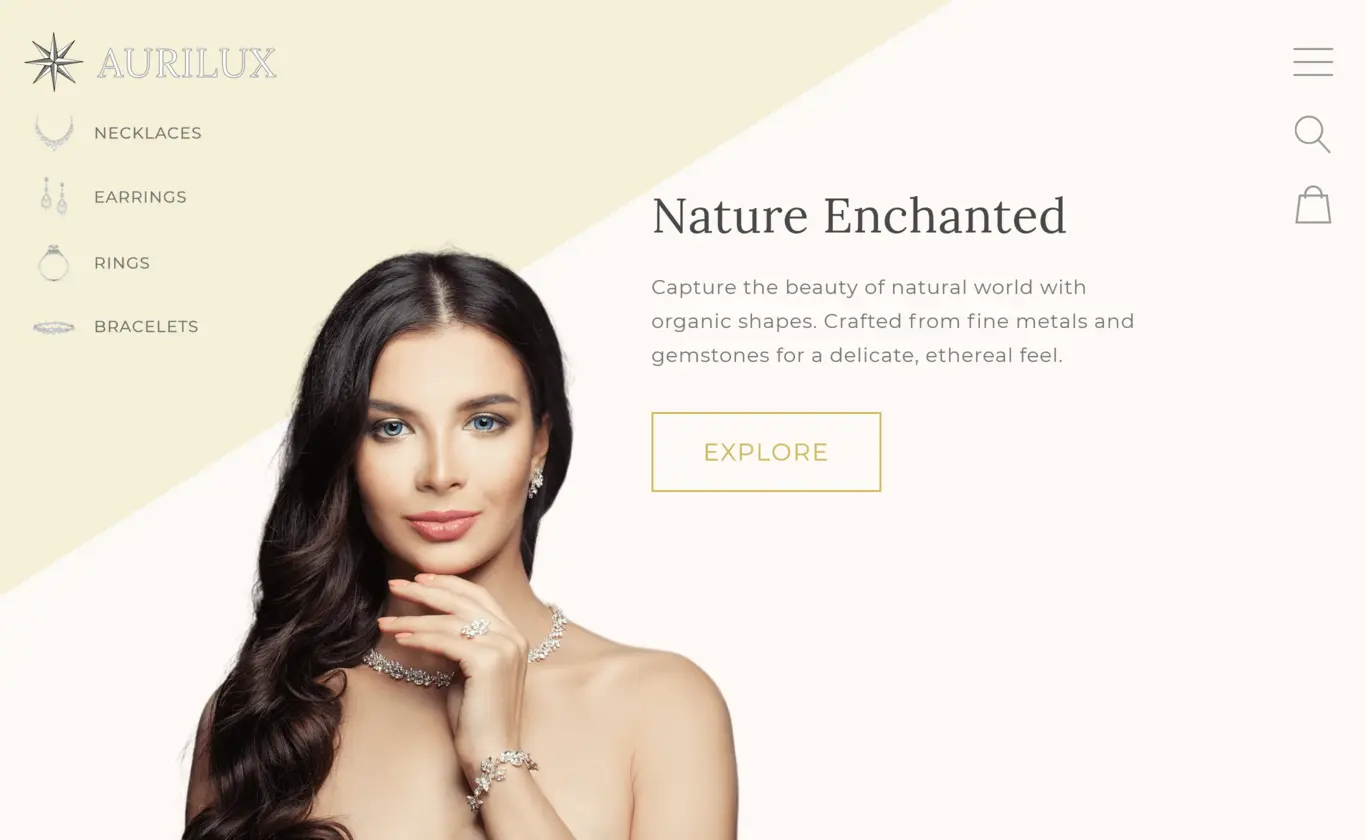
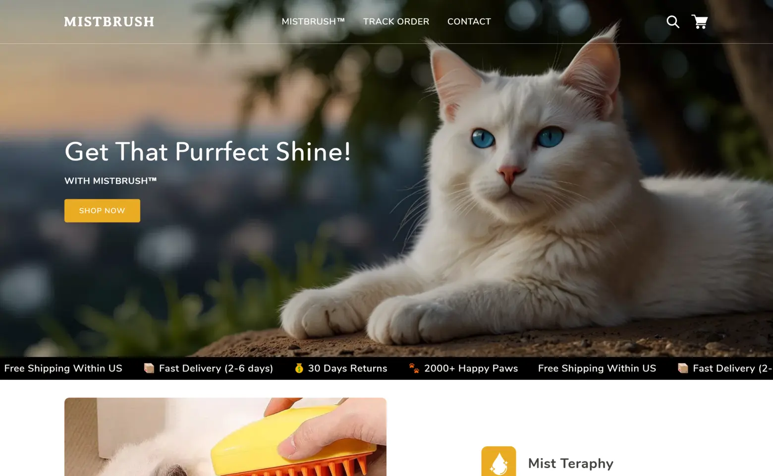
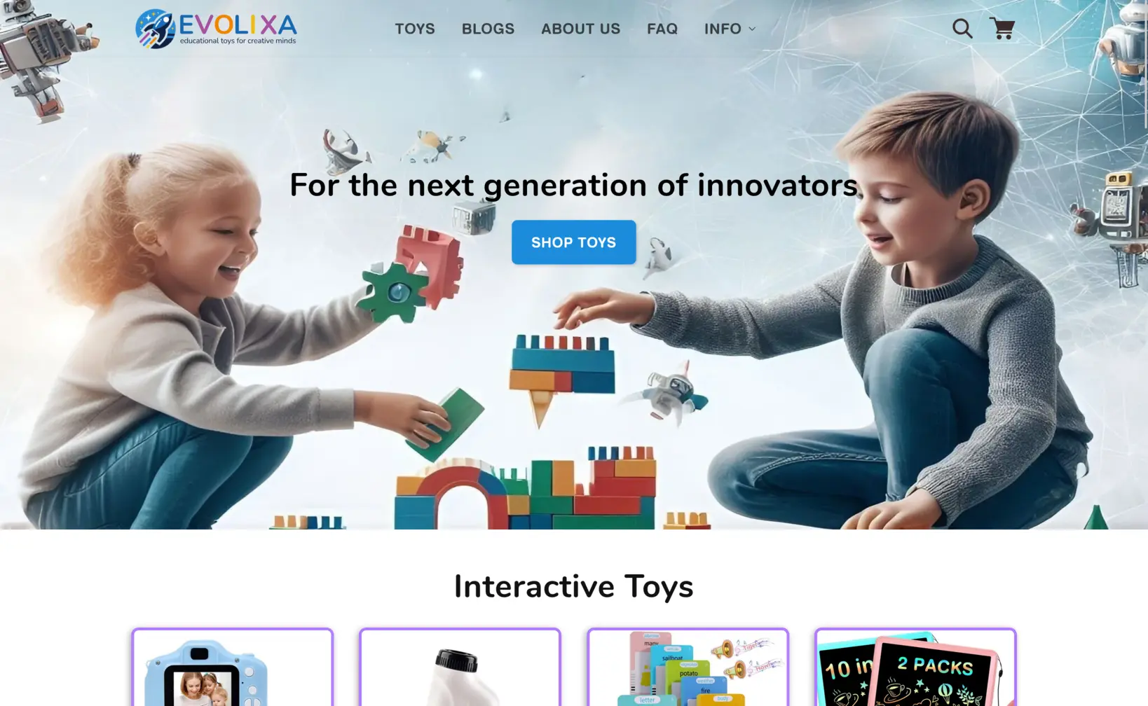
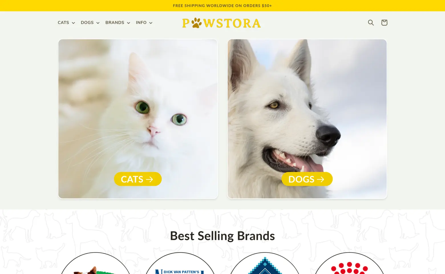
Web Design
Your website is often the first impression your brand makes. Let's make it unforgettable. I specialize in designing visually appealing, user-friendly websites that reflect your unique identity.
Whether you need a fresh design or a complete overhaul, I ensure the result is both functional and beautiful, keeping your audience engaged from the very first click.
Development
I create fast, responsive websites that deliver a seamless user experience. Whether you’re starting from scratch or troubleshooting issues on your existing site, I ensure everything runs smoothly and efficiently.
Looking to go beyond websites? I can develop custom web applications with robust backends and tailored features to meet your data and functionality needs. Each project is built with performance and scalability in mind.
Brand Design
A strong brand starts with understanding its essence. I analyze your competitors, target audience, and goals to create cohesive visuals, branding elements, and a unique identity that sets your business apart.
While I can design basic logos and assets, I’m not a professional graphic designer. For projects require advanced graphic deisgn, I collaborate with talented designers. My expertise lies in crafting cohesive branding and visuals, setting a strong foundation for success.
Conversion Optimization
Turning visitors into customers is my specialty. I can redesign your website with a conversion-focused approach, integrating features and methods that drive results, such as clear value proposotion, compelling offers and sales strategies.
I also offer recurring data-driven A/B testing services, ensuring continuous optimization and boosted profits over time. With each test and adjustment, we’ll uncover what works best for your audience, keeping your website ahead of the competition. Let’s transform your website into a powerful sales tool.
Performance Optimization
I optimize your site's speed to ensure quick load times and smooth interactions, improving both user experience and search rankings.
Performance also includes accessibility, making your website usable for everyone, regardless of ability. I ensure your site is WCAG compliant, which not only improves your search ranking but also protects your business from potential accessibility-related lawsuits. Accessibility is essential for inclusivity, legal compliance, and better SEO.
Technical SEO
Your website deserves to be seen. I focus on technical and on-site SEO to improve your search rankings and overall visibility. From optimizing your site structure to fine-tuning metadata and keyword integration, I’ll ensure search engines love your site.
While I focus on technical SEO and on-site optimization, I can also assist with content strategies that drive conversions. For in-depth blogging, I recommend professional writers who specialize in that area.